Top 11 Web Design Trends for 2019
If your website is your showroom, then web design is your visual merchandiser. Just as merchandisers transform physical stores into mesmerising, impossible-to-resist, shopping experiences that turn browsers into buyers, web designers turn your website into a curated user experience that not only attracts browsers but keeps them on your page and converts them into buyers.
Having a good web designer curate your website is one of the most fundamental aspects of your site. But as with most things, they experience trends and fads, the internet is constantly changing and evolving from the computer to laptops, mobile optimisation, wireless blue tooth headphones, Siri, and social media. The rate at which new technology and designs are being introduced is as exciting as it is overwhelming.
In the past, bold colours, asymmetrical layouts, apps, and smarter AI has reigned supreme on the web design front. But things are changing again, and now that we’re in the second half of 2019, it’s important we assess what the most important web design trends are for the remainder of the year.
The remainder of 2019 promises the ultimate union of both technology and visuals. Here are the 11 best trends set to sweep the web design scene in 2019.
Simplistic Colour Palettes, like Black & White.
Considering your colour palette is one of the most important elements of any website design. Colour invokes a feeling, it elicits a mood. Do me a favour and think about it for a second. Think about each colour and the message each delivers just by thinking of it. Think of red first, now think of olive green, now think of bright purple. Each colour invoked a different emotion. That my friend, is called colour psychology, and it’s how web designers implement certain colours to cultivate a particular mood.
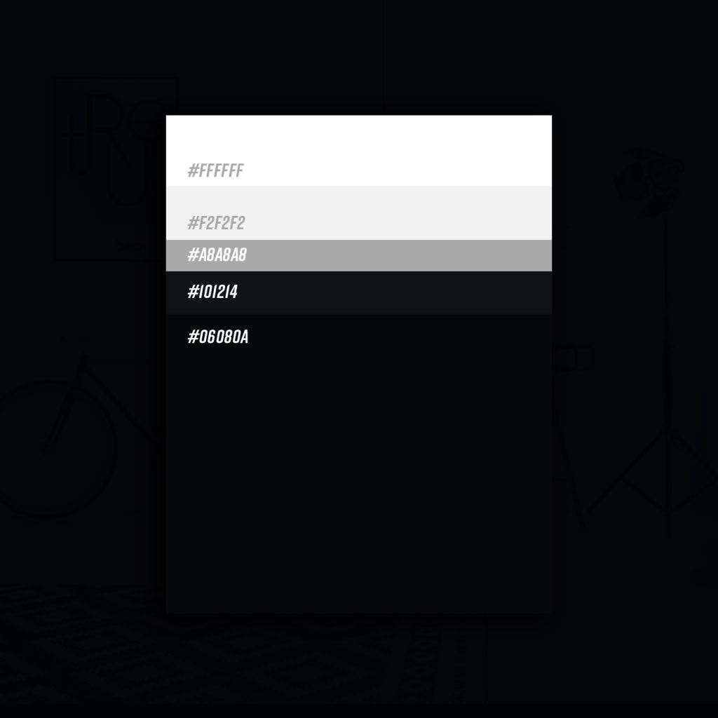
Colour completes a brand vibe and brings everything together in a cohesive, and aesthetically pleasing package. However, what you may not have noticed is that the absence of colour also sends a very strong message too. In 2019, we’re seeing more and more colourless, black-and-white, web designs. I’m not going to lie, they’re also successfully establishing a real mood.
When colour is absent, it allows us to see the world differently - in black and white. What do you notice when colour isn’t there? You begin to notice other aspects of design, such as shapes, textures, and patterns. A simple black and white design enables you to make a colourless statement that utilises other design elements.
Imperfect shapes & lines are starting to emerge
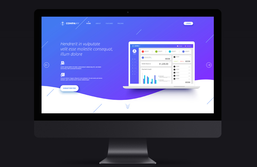
Like most smart designs, web pages are generally arranged in a grid-like system, building block upon block, layer upon layer, in a clear and structured format. In 2019, web designers are straying from the rule books, and instead opting to sub out the jagged blocks for uneven circles, flowing lines and imperfect shapes.
The idea is to remove the rigidity of the previous approach to web design and turn instead to a more organic and natural aesthetic with soft edges and smooth finishes. In a way, it’s the a trend in which the web designers is aspiring to mimic nature in a virtual world. To embrace the union of both nature and technology.
Everyone's favourite nostalgic trend, Glitch art.
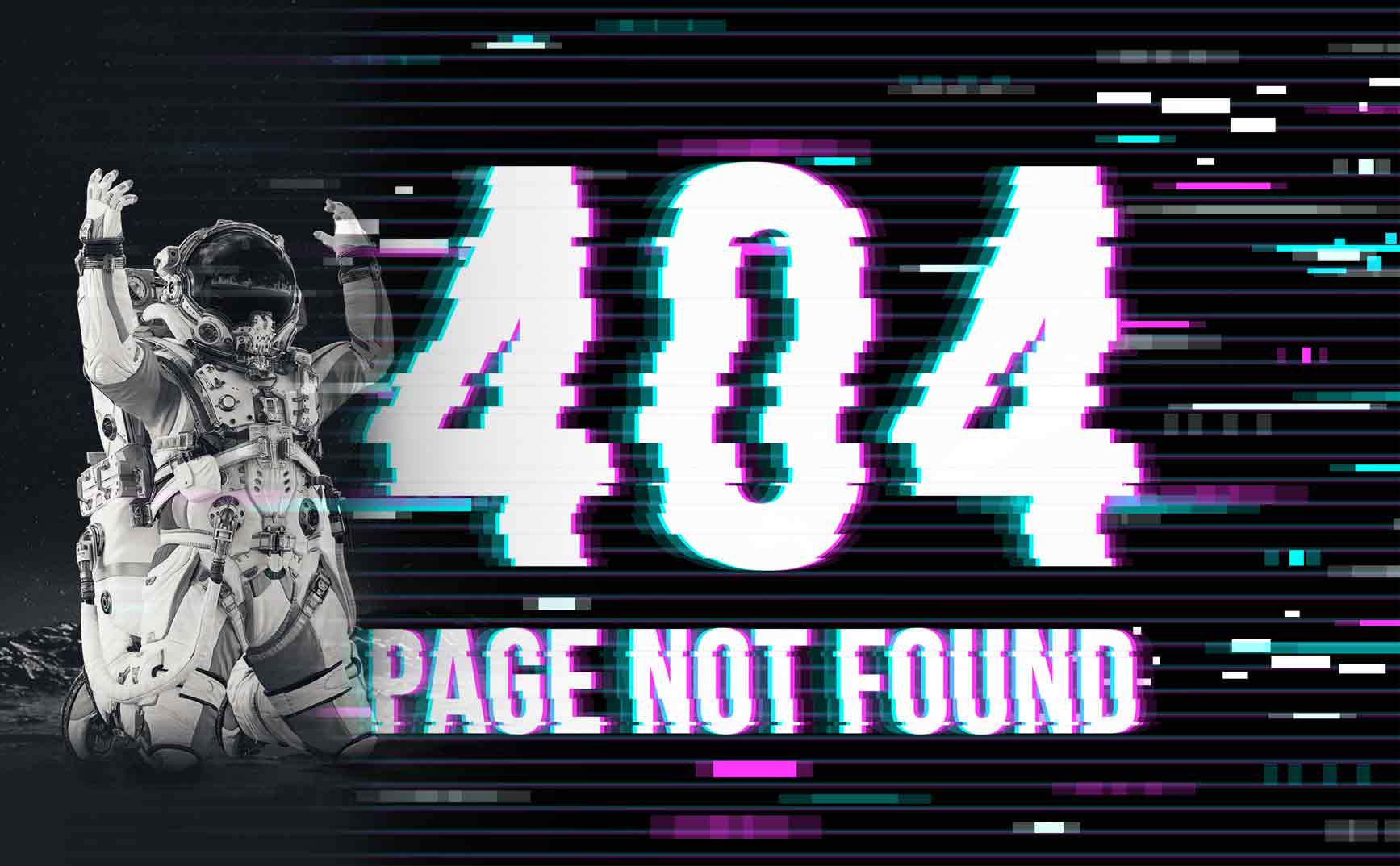
Retro is always making a comeback in some form or another, but this year in web design, everyone’s favourite retro vibe, Glitch Art, is settling in on our ‘top web design trends of 2019’ list.
So what exactly is glitch art? It’s an imperfect design, like a scratch on a record player, a frozen screen, a faulty film. It’s when something is warped, glitchy, overexposed. It’s like something hasn’t buffered correctly and there’s a glitch in the final display. THAT, is glitch art. A captivating image that’s perfect in its imperfection.
Glitch art gives an old-school, somewhat psychedelic feeling. It transports us directly to a different era, another time when technology was this small, relatively new aspect of our lives. It’s almost an eery feeling, a nostalgic yearning for a past we can never get back to.
This type of web design very quickly, and successfully takes the user on a journey to a part of there life when things were simple, imperfect and human.
Video is Heralded the hero, again.
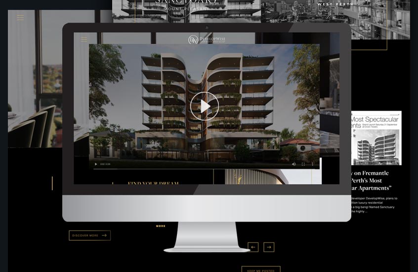
You’ve heard it a million times by now, and if you haven’t, you actually must be living under a rock - and even still I think you would have heard it! The video trend is not exactly new news. What is new news however is how it’s now being integrated into the user experience. Google is now blending video into its search results more regularly, leading many web designers to take advantage of the opportunity to by populating sites with quality video content. From Facebook live, webinars, website hero videos, social media, video is not only trending but it’s quickly taking preference over static imagery.
Adding video into your web design serves two seriously beneficial purposes. A video not only adds depth and layers to your website and caters to people who interpret information visually. It also easily communicates an idea or a message in a quicker time frame than text or image alone can do. Video tells a story, it captures your viewer's attention and keeps them on your website page for longer.
Perhaps one of the biggest benefits of implementing more video in your next web design is that the viewer will remember 95% more of what the view compared to 10% of what they read.
Move over sans serif, Senior Serif is debuting on the big screen.
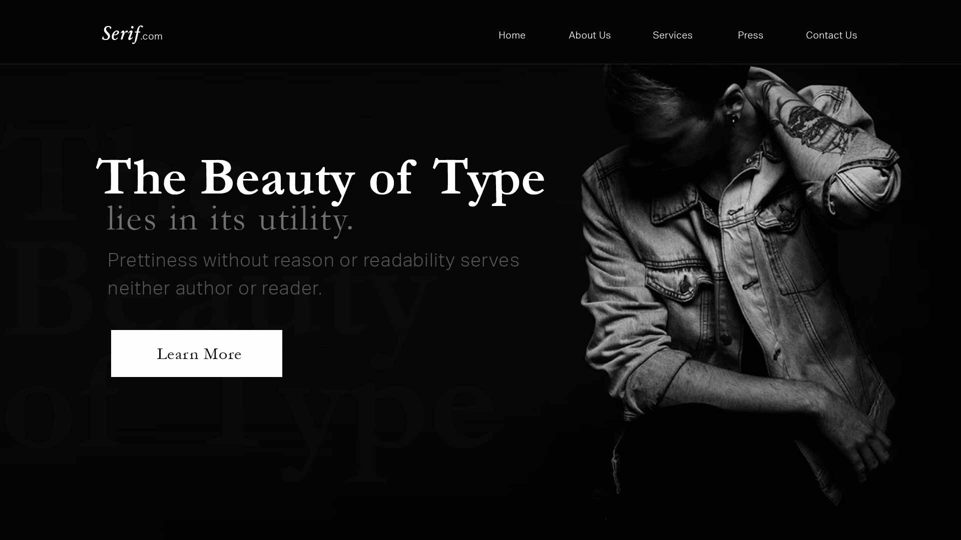
It’s true, and although you’ve been brought up on the notion that ‘sans serif’ is screen king, and ‘serif’ is its print queen, those rules are about to change.
While serif is associated with ‘old school’, more and more brands are turning to bold serifs to make a statement. Sans offers simple and easy readability and are still the crowd favourite for long bodies of copy, like this blog for example. But headers and subheaders are open to breaking the rules, and brands are now of the opinion that serif typography may, in fact, be the perfect header or CTA font.
So why the seemingly sudden embrace of serif on screen? It’s pretty logical actually. Sans was designed to fit in, it’s consistent and clean, but serif was designed to be decorative - to stand out - coincidentally like a header, or a CTA. The perfect union, I say.
Micro-interactions & micro-animations
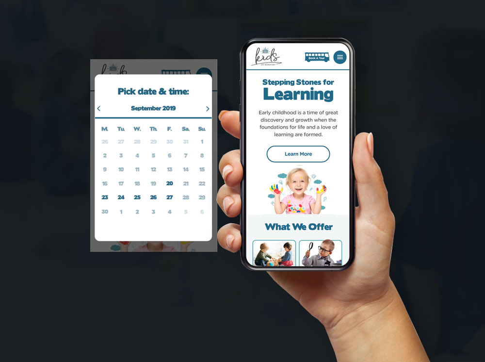
Micro-interactions & animations have been trending over the last few years, with features like parallax scrolling, and beeps when you receive a Facebook Message. But in 2019, they’re appearing more frequently, and in a more subtle manner. Micro animations and interactions are designed for one purpose: to delight the user and create an experiential event that is rewarding, interactive and ultimately human.
They’re designed to fill your website with energy without sacrificing things like page loading time. Smart! Every time an action is taken on a website and there is an automatic response to it, that is considered a micro-interaction.
In 2019, you can expect to see more of these animations appear in a number of different ways. Such as mouse hovers, sound effects, and motion pictures. This will help to involve your user in your website and act as road signals that more efficiently direct your user where to go whilst on your site.
A micro-interactions success is measured by its ability to direct the user to the end goal rather than distract them from it.
The Chatbot Revolution
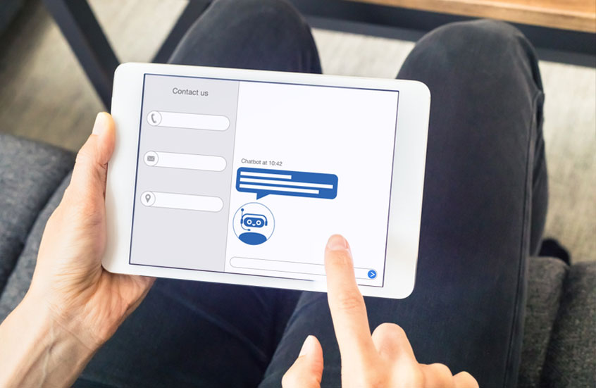
Chatbots have been around for a while now, and people have been saying their trending the entire time. But it looks as though 2019 will truly be the year for ultimate chatbot domination. The reason it has taken this amount of time to truly begin to trend is that chatbots were a little before their time.
The intention behind it was great, but the AI learning wasn't up to scratch. It was still too ‘gimmicky’ for users to take seriously. No one wanted to talk to a chat robot with clear limitations. But in recent years, more advancements in machine learning, AI and chatbot functionality has allowed them to become more functional, intelligent, efficient, and ultimately human.
The newer chatbots will be more highly customised and seamlessly integrated into your website and the customer's user experience. The new designs will also make chatbots appear more alluring and prominent on your site. The chatbots may also extend past the current model of a messenger box, and evolve into more of a mascot or a human holographic. But perhaps the holographic is a few years off still.
Striking Minimalism Reigns Supreme
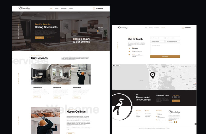
Perhaps one of the most classic and timeless web design trends, minimalism is often the go-to aesthetic of choice. The fewer elements and content on a website, the less your audience will have to think. If a website is designed in the right way, it will show the user exactly what she is looking for.
Minimalism will continue to dominate the digital landscape in 2019. Animations and fade-in effects that make scrolling more engaging will give web pages freedom to space out their content and thus result in more whitespace, contrast and clear typography without too many distracting elements.
Mobile-First Design & Thumb-friendly navigation

Mobile shopping has never been more prevalent, it’s at an all-time high, with more than 2 billion people per year making a purchase from their phone. That is a significantly high statistic that should make you want to rethink your entire design strategy. Web designers certainly are with the new ‘mobile-first’ design methodology.
At one stage, websites were only designed for computers. Move forward a few years & they were starting to design websites for laptop. In 2008,‘responsive design’ was introduced, with tablets and phones becoming a more popular choice for web browsing. But in 2019? With thanks to Googles roolout of the mobile-first index in March last year, we’ve moved into the realm of mobile-first websites and thumb-friendly navigation.
What does “Mobile-first” mean to Google? It means that Google’s little bot workers will be checking your website’s Mobile design before they check desktop when deciding where to rank you in their search results. More and more in 2019, users can expect to experience thumb-centric web design to make website navigation on small screens more seamless, intuitive and accessible.
World Wide Diversity

One of the biggest trends you might have noticed is the inclusivity the internet is taking to cater to all people. The worldwide web is honing in on worldwide diversity, and so far we like what we’re seeing. You might have caught a glimpse of this shift to represent people from all walks of life with the introduction of different skin types in the emoji section on your phone.
With more than half the world's population using the internet daily, web designers are making an intentional effort to ensure everyone feels represented online. Their will be a continued shift toward reflecting the personas of people in different cultures, races, abilities, ages, genders and careers.
Inclusivity is the name of the game, and diversification is how web designers are trying to achieve it.
Pick a side, with Split-screen websites
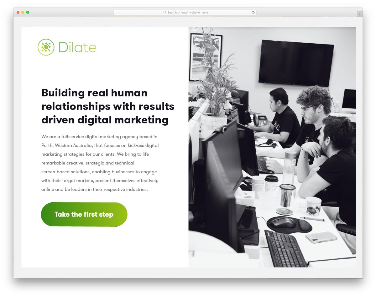
Split screens are making their way into the web design trend list. It’s new and web designers all over the world are playing with the new art of split-screen websites. But it’s important to realise that it can really make or break your site, so proceed with caution, because when it works, it’s a striking work of art, but when it doesn’t, it can really damage your websites ability to convert.
In laymen's terms, a split-screen website simply means that the content on the website is divided vertically between the left and right side of the page. It’s a new approach to integrating visual hierarchy and is subject to change depending on the dialect of the site - the right to left, left to right - depending on the most common reading habits of the user.
Whilst it’s not necessarily the first pick for a lot of web designs, it can create a striking impact for creative business types. If you’re in photography, art, fashion, food or architecture this can be a smart way to draw the readers attention to your page in a more structured and intentional way.
Looking ahead to 2019 web design trends
Our Blog

Our team of digital and business experts will guide you to the right direction.
Let's Talk